For @sightedmagazine (unused)
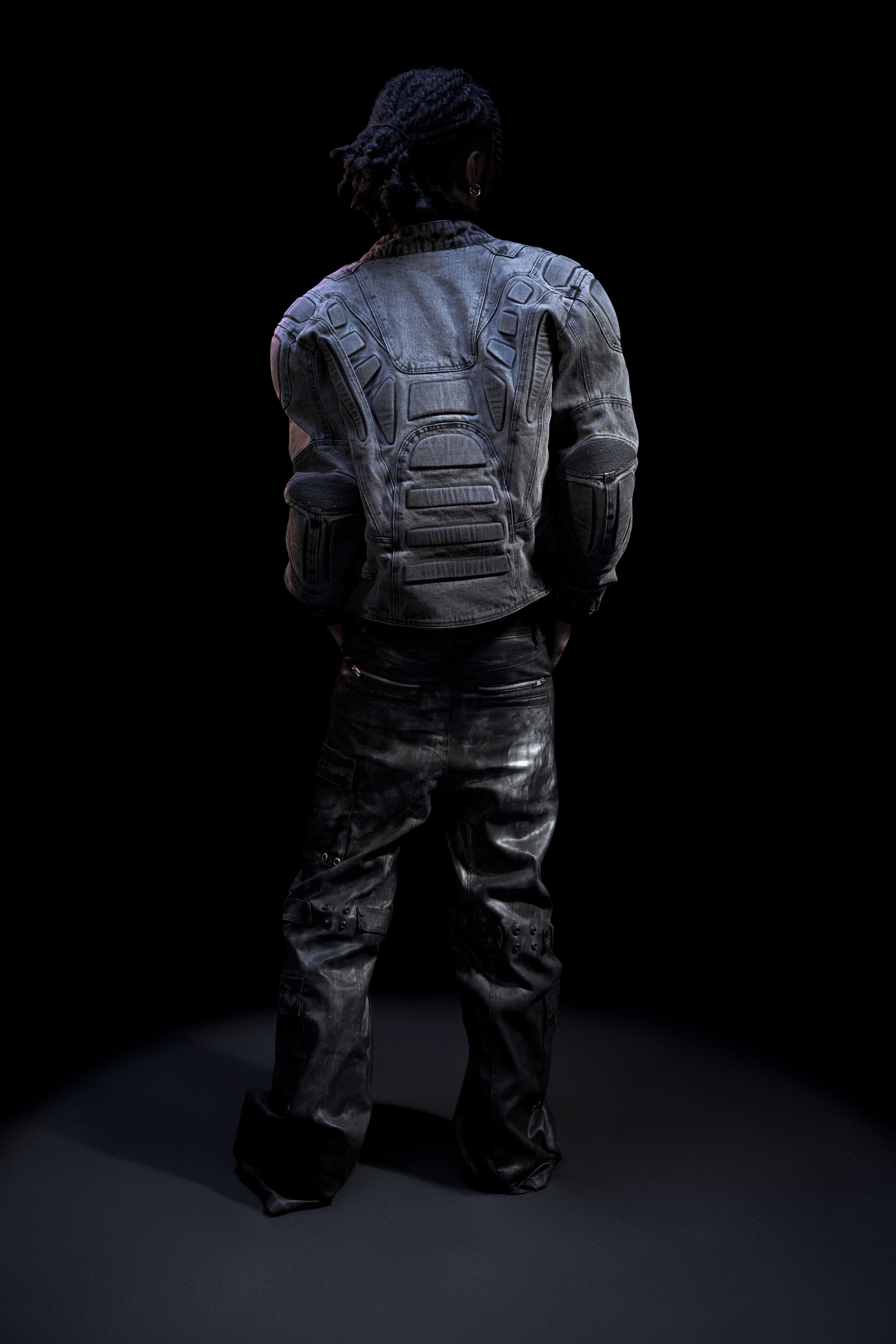
Creative Directors: @skpthirteen
Photographer: @flashedbyelisa
Editing: Me
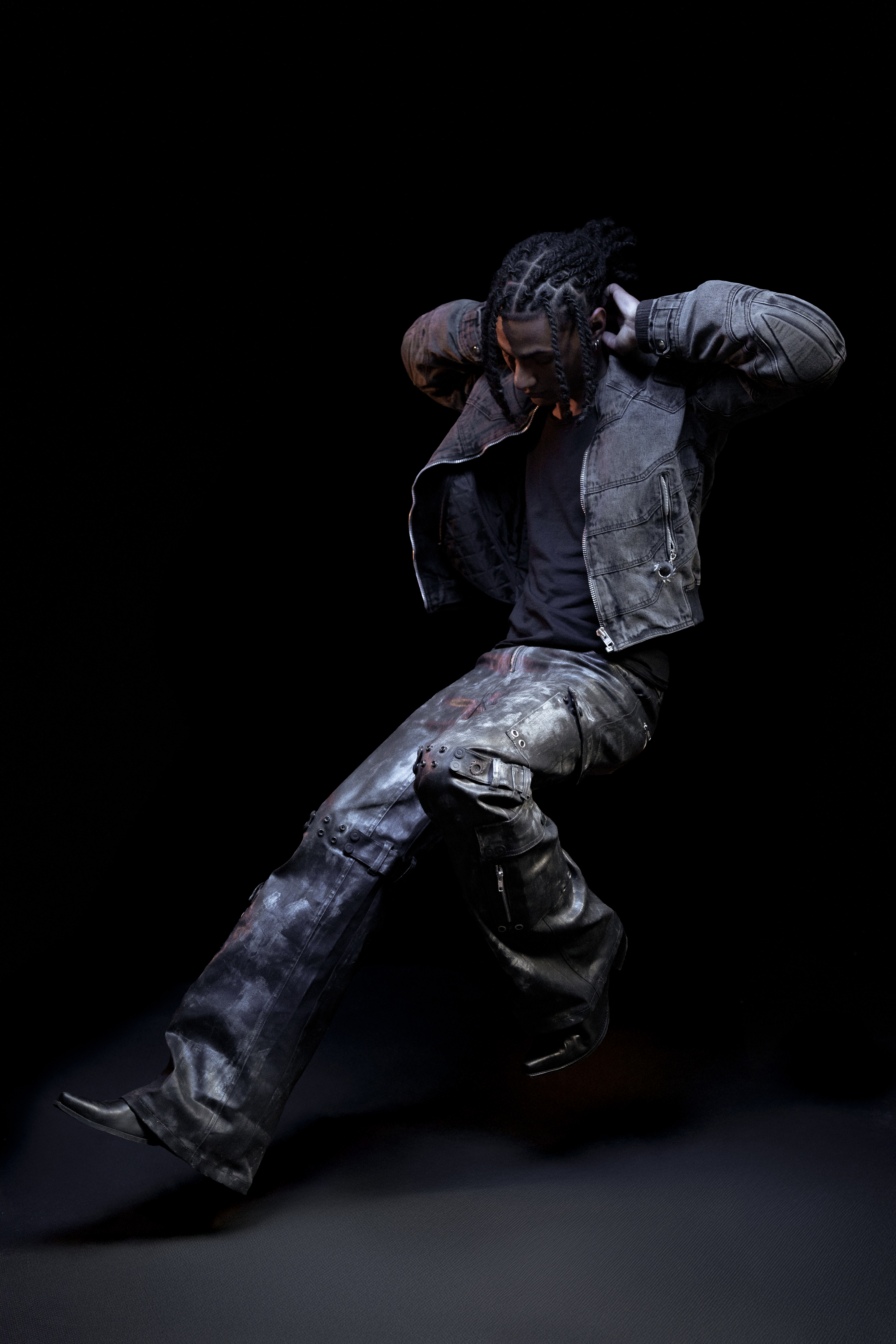
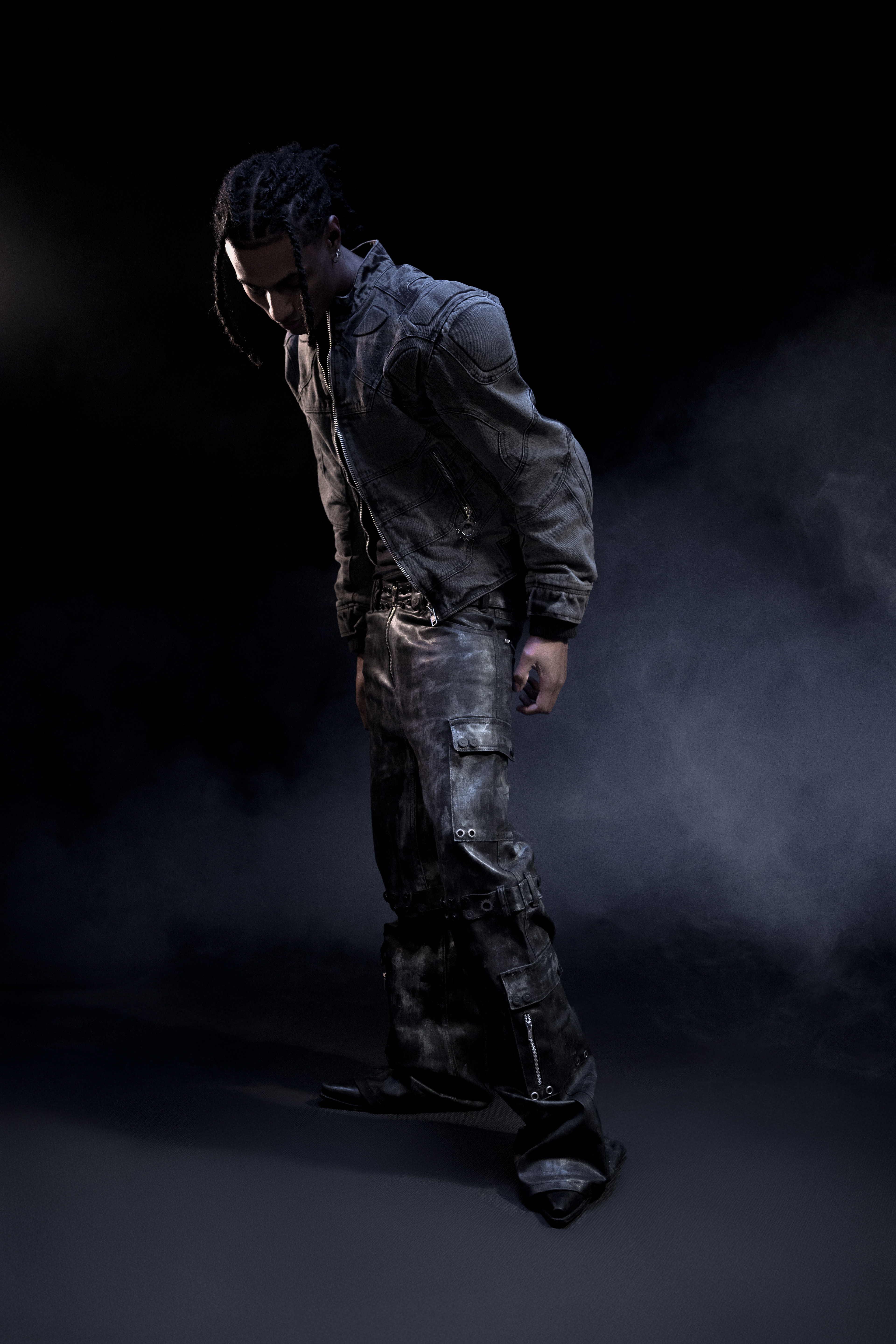
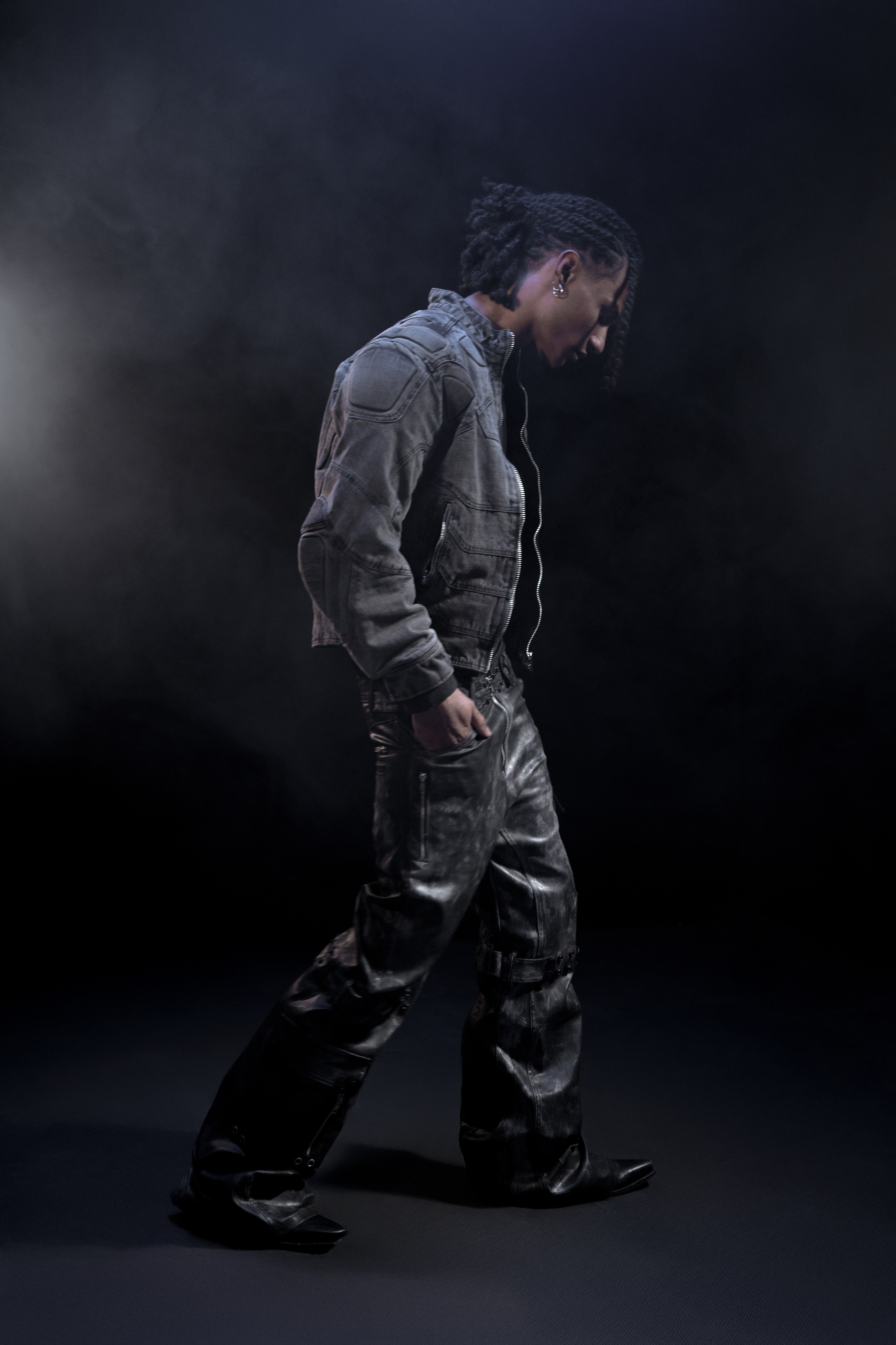
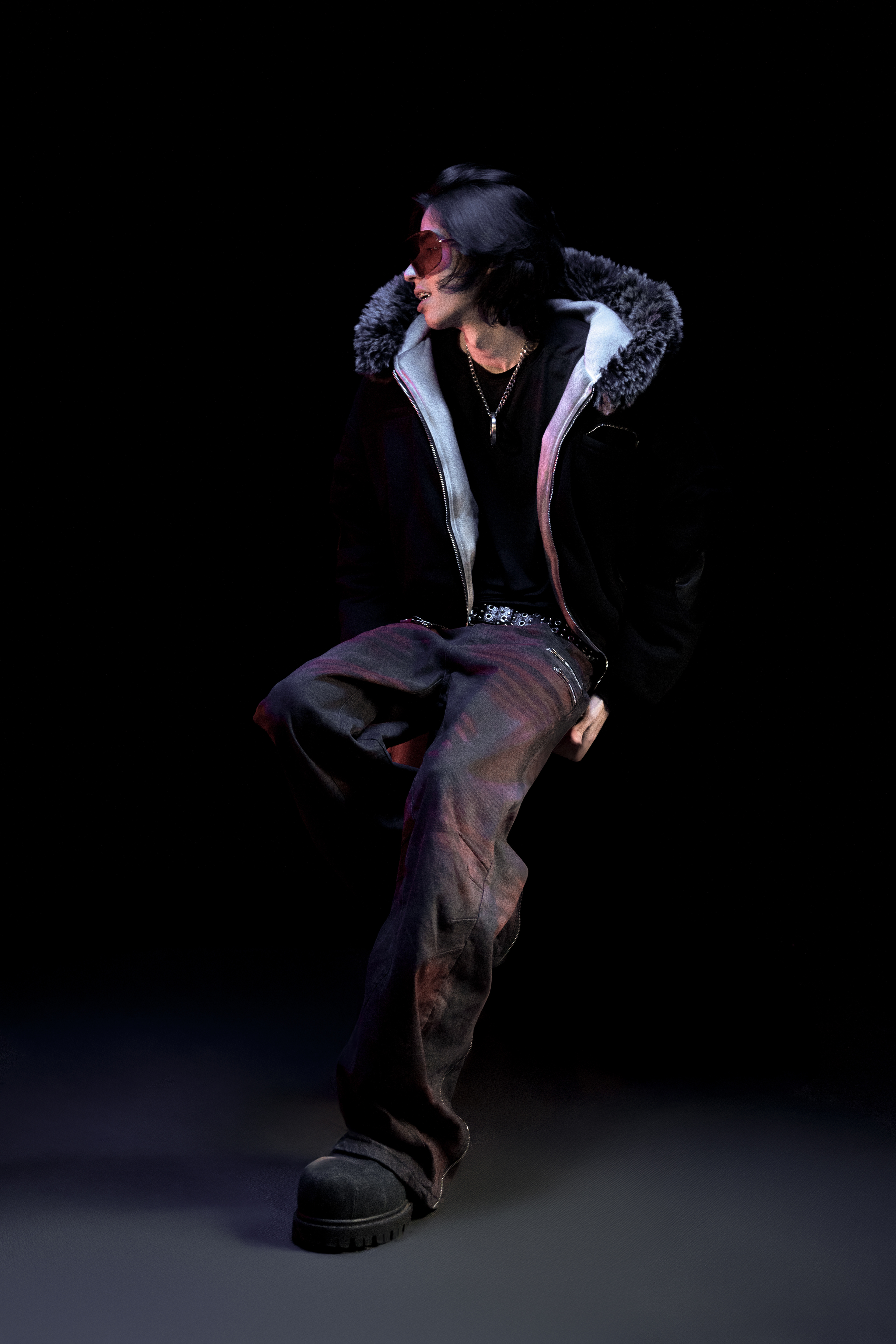
The hardest part about grading this was the clarity. As it was for a magazine I had to emanate a feeling of professionalism and realism in the piece. We agreed the blue was far too intense, I aimed to neutralise it entirely while still maintaining the other colours present and reviving colours that had been drowned out by the blueness and darkness. Removing the chair was the easiest part, altering the colours so it is identical to how each piece is in neutral light was harder and the shadows were the hardest.
I enjoyed this a lot, it was good to challenge myself with something less conceptual.
I enjoyed this a lot, it was good to challenge myself with something less conceptual.
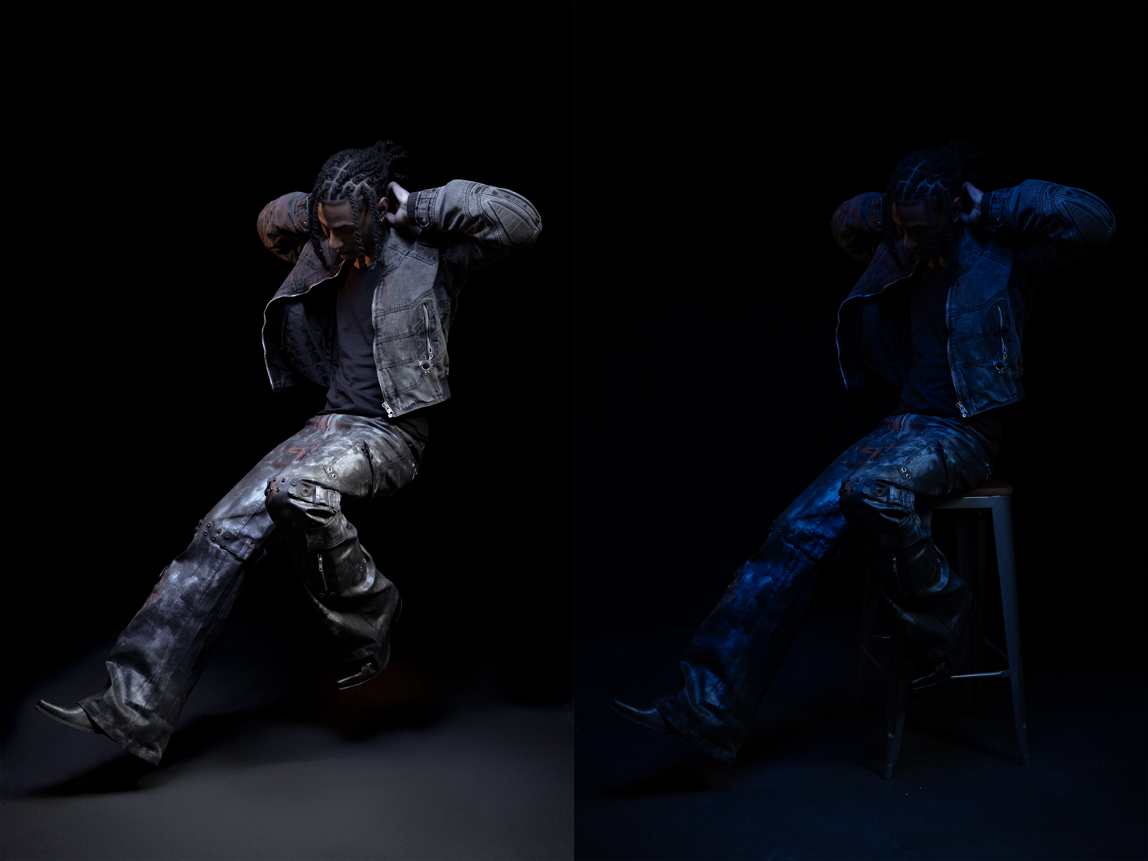
BEFORE AND AFTER